Case Study

Website Redesign
Industry: Media, Non-Profit
Type: Website Design & Development
Overview
Strategic Website Redesign
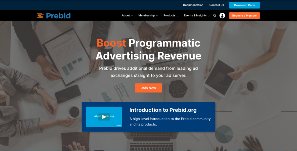
In a strategic move to not only enhance their digital footprint but also embolden a sense of community among its members, Prebid.org entrusted We Are Volume with the redesign of their WordPress website.
Our mission was twofold:
- to transform their online platform into a dynamic, user-friendly space that reflected their innovative spirit,
- and to create an exclusive ‘walled garden’ content area that would resonate with current members and attract new ones.
Full Site Editing for Future-Proof Flexibility
One of the project’s highlights was the focus on Full Site Editing, a feature that allows for extensive customization and easy content management in WordPress. By leveraging this capability, we equipped Prebid.org with the flexibility to publish and modify content independently, without requiring extensive development knowledge. This approach not only streamlined their content management process but also future-proofed their site, enabling easy updates and adaptations as their needs evolve.
The Content Walled Garden
The concept of the walled garden was central to our design strategy.
This exclusive area was crafted to give existing members a sense of belonging and engagement, providing them with content tailored to their interests and needs.
By offering this unique, members-only space, we aimed to deepen the sense of community within Prebid.org.
Increase Visitor Engagement
Simultaneously, the walled garden served as a powerful tool for conversion.
By showcasing the value of this exclusive content, we aimed to entice non-members to join the Prebid.org community.
This approach was designed to not just increase membership but also to build a loyal user base that felt invested in the platform.
This strategic enhancement of Prebid.org’s website was more than a redesign; it was a step towards strengthening the bond with their community and expanding their reach.
Our Services Bundle
To bring this ambitious project to fruition, We Are Volume employed a multifaceted approach, combining various key services.
- UX Design: Ensuring that every aspect of the website was intuitive and user-centric.
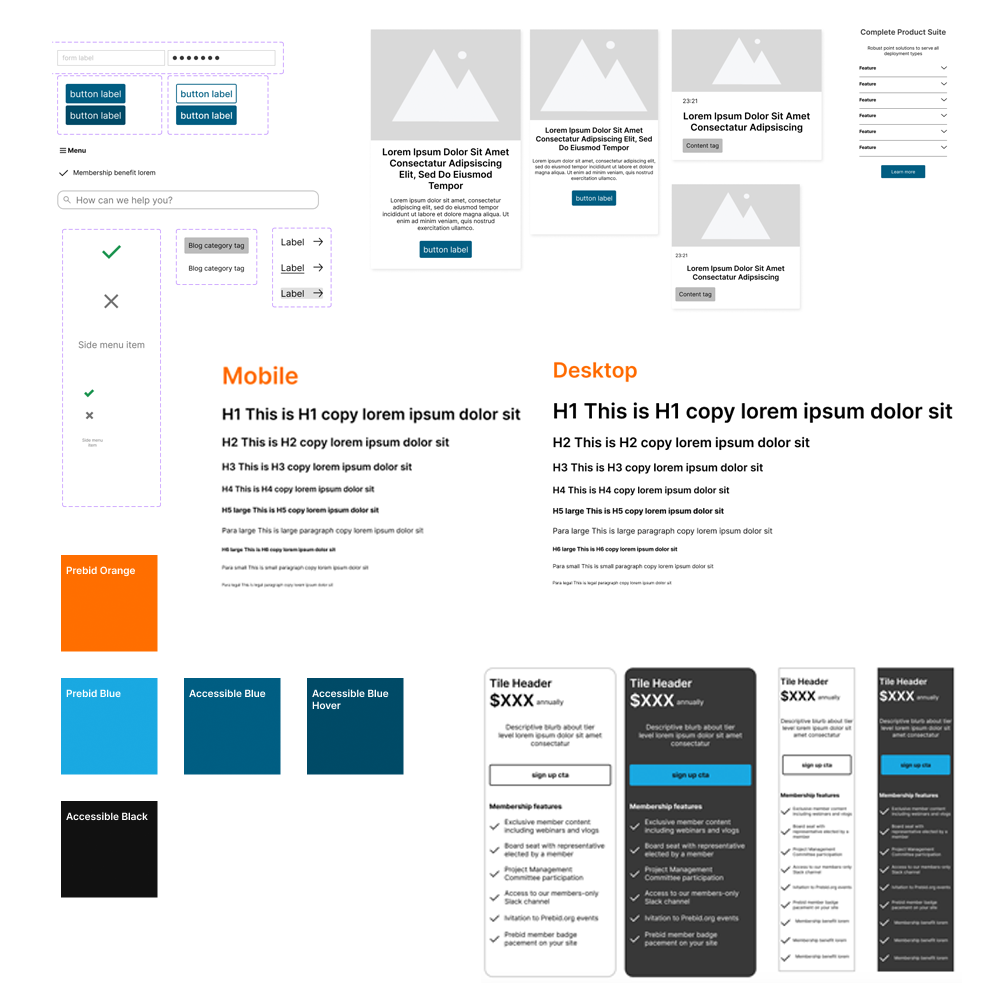
- Design System: We implemented a robust design system that provided a consistent and scalable framework
- Website Development: Our development team worked tirelessly to build a site that was not only visually stunning but also technically sound
- Search Integration: A crucial part of our solution was integrating WordPress content with Algolia Search and GitHub Pages
- Content Migration: The migration of existing content was handled with utmost care, ensuring that the transition to the new site was smooth
- Art Buying & Retouching: Selecting and refining visuals was key to the project’s aesthetic success

UX Design
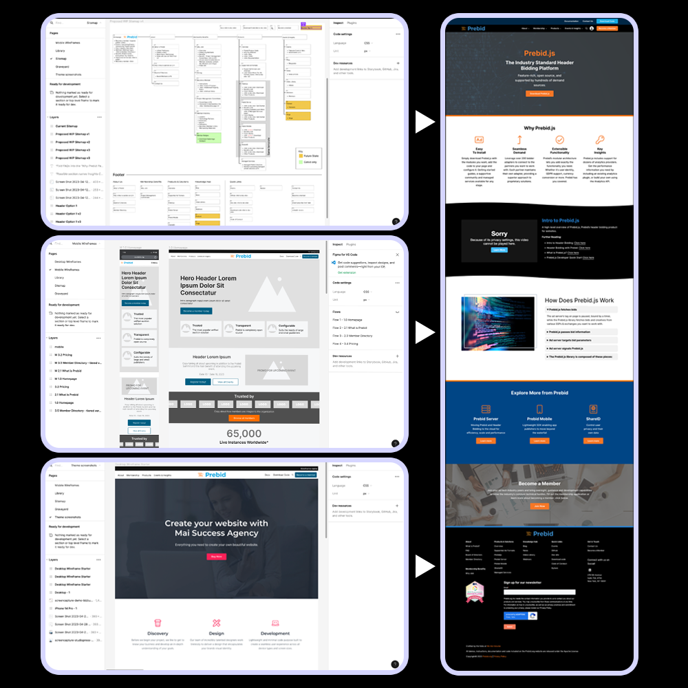
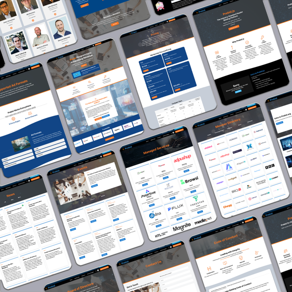
Our UX Design team collaborated to develop a new sitemap, wireframes to support mobile & desktop and set the global navigational structures.
A critical step in our UX journey was choosing a battle-tested and flexible WordPress base theme. This theme needed to be flexible yet powerful enough to support a wide range of content and functionalities.
After careful consideration, we selected a WordPress commercial theme that aligned seamlessly with Prebid.org’s vision and technical requirements.
The result is a site that visitors could navigate effortlessly, simplified publishing so the business could keep pace with the market, while leading to increased engagement and a better overall user experience.
The User Experience Design phase set the foundation for a website that was not only visually appealing but also functionally efficient and user-centric.

Design System
The website design phase for Prebid.org was driven by a key principle: harmonizing aesthetic appeal with functional robustness.
Our aim was to create a design that not only captured the essence of Prebid.org’s brand but also delivered a seamless user experience, while working to push the limits of the commercial theme.
In creating the visual language for the site, we focused on inclusivity. The design needed to resonate with a diverse audience, from tech-savvy individuals to those less familiar with programmatic bidding.
Our design choices, therefore, were deliberate and aimed at ensuring clarity, simplicity, and engagement for all users.

Art Buying
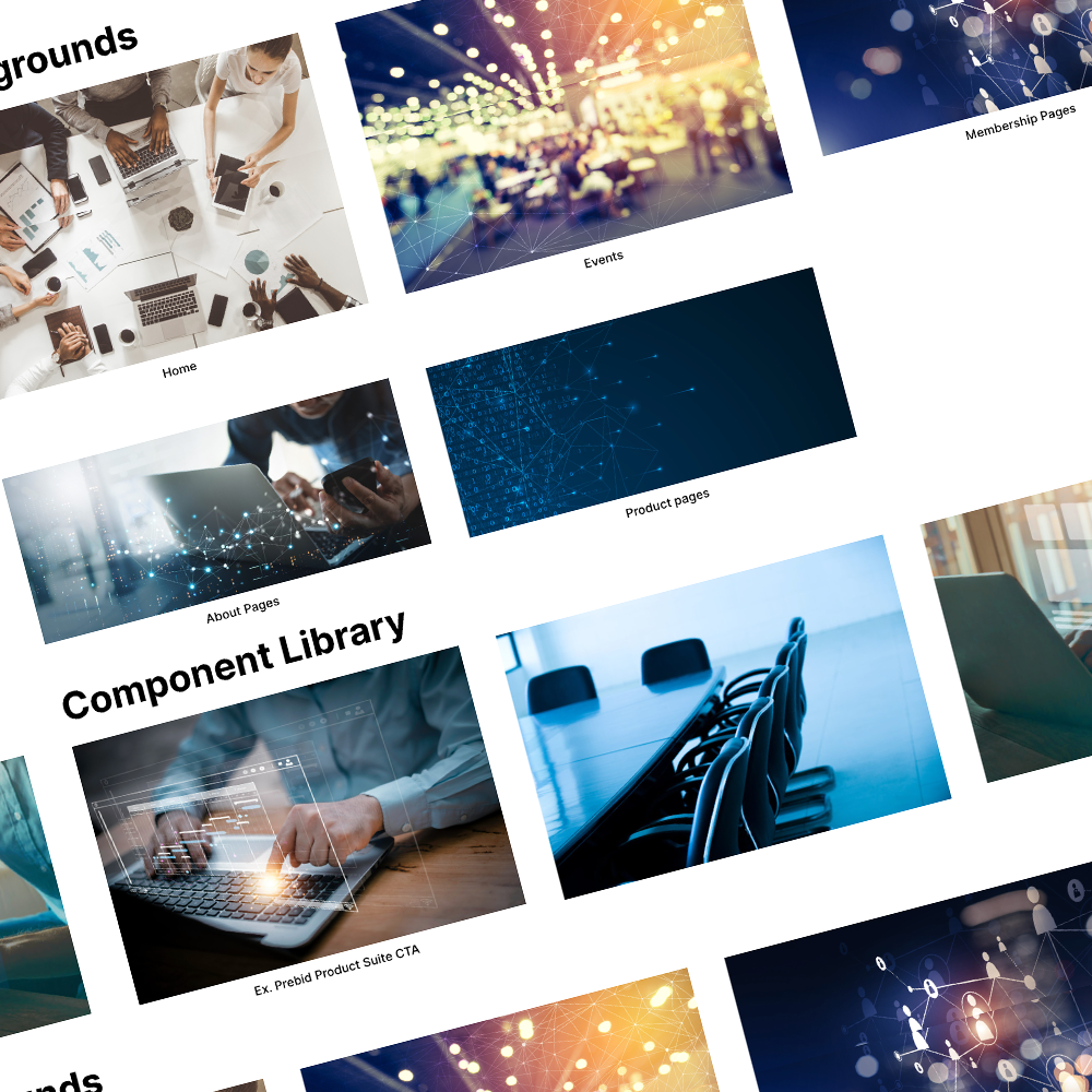
Collaborating closely with Prebid.org, we embarked on a meticulous process of image buying. This involved selecting images that resonated with Prebid.org’s brand values and the website’s design ethos. Each image was chosen for its ability to convey the right message and evoke the desired emotional response.
Once the images were selected, our team of professional retouchers worked on fine-tuning them. This retouching process was crucial to ensure visual consistency across the website. We adjusted colors, tones, and compositions to align with the site’s design framework, enhancing the overall visual appeal.
The carefully selected and retouched images significantly elevated the user experience. They provided a visual narrative that complemented the text, making the site more engaging and memorable. This visual enhancement was particularly impactful in conveying complex concepts in an accessible and appealing manner.

Content Migration
Content migration was a pivotal aspect of the Prebid.org website redesign. Our objective was to seamlessly transition existing content to the new platform, ensuring no disruption to the user experience and preserving the integrity and SEO value of the content.
As content was migrated, we also took the opportunity to enhance it for the new platform. This involved reformatting, updating imagery, and ensuring consistency in tone and style. The goal was to not only migrate content but to elevate it, making it more engaging and aligned with the new user experience.

Integrated Search
A crucial component of our project for Prebid.org was the integration of the WordPress site content (events, videos, news) with their existing Algolia Search Index attached to GutHub pages for thorough technical documentation. Recognizing the importance of efficient information retrieval, especially for technical implementers, this integration was designed to streamline the search experience across the platform, no matter the site entry point.
The integration of the WordPress site with Prebid.org’s Algolia Search Index and GitHub pages was a pivotal aspect of the project. It exemplified our commitment to delivering a user experience that was not just functional but also intuitive and responsive to the unique needs of Prebid.org’s audience.

Web Development
Our development team, equipped with the finalized design and a clear understanding of Prebid.org’s objectives, set out to build a site that was both robust and flexible.
Leveraging our Agile methodology, the development was structured into sprints, allowing for regular reviews and adaptations. This iterative process ensured that each feature and functionality was aligned with Prebid.org’s vision and user needs.
Ensuring that the website performed flawlessly across different browsers and devices was paramount. We conducted thorough testing on various platforms, fine-tuning every element to ensure seamless functionality.
This meticulous attention to detail meant that the website provided an optimal experience, whether accessed from a desktop, tablet, or phone.
Results
The launch of the redesigned Prebid.org website was meticulously timed to coincide with the Canne Lions award show in Paris, a prestigious event celebrating creativity and innovation.
From start to finish we launched the new experience in 10 weeks.
This strategic timing was not only about making a statement but also about leveraging the event’s visibility to maximize impact.
