How Do You Maintain Color Consistency Across High-Volume Video Production?
How Do You Maintain Color Consistency Across High-Volume Video Production?
In the fast-paced world of digital marketing, video content stands as a critical component of effective communication strategies. Especially for a production house like We Are Volume (WAV) where we often are handling high volume versioning, across a number of media types, downstream in the production.
The reality in production is assets often come from a number of sources and its quite easy for something to fall out of guideline from time to time. Catching these early can make or break a production. To that end, we have built safeguards into our business based on this reality.
Maintaining consistent brand identity across various media, especially in video, poses additional unique challenges.
One such challenge is ensuring color grading consistency, which is vital. This blog delves into our comprehensive approach to maintaining brand guideline quality in video production, leveraging our real world learnings to develop best practices that all of our projects benefit from.
From initial asset intake to final output, outlining the tools, techniques, and best practices we employ to achieve impeccable results. Let’s dig in.
The Importance of Initial Asset Quality
Quality begins with the very first step of production: the intake of assets. The quality of the initial assets sets the tone for the entire project. Poor quality or non-compliant assets can significantly derail production timelines and inflate costs due to additional correction requirements.
To mitigate this, we have implemented a series of standardized intake procedures designed to ensure that all incoming assets meet our stringent criteria and nothing finds its way to an operator until we have a look under the hood, to ensure productions are based on quality at the on set.
- Create Checklists: We have developed detailed checklists that outline the technical and creative specifications required from all assets. These checklists include parameters such as resolution, frame rate, and specific color spaces, ensuring that all incoming files are compatible with our workflow and meet the baseline quality standards.
- Asset Review Sessions: Upon receiving assets, our team conducts thorough review sessions. These sessions are not merely cursory glances but deep dives into how well the assets align with the established brand guidelines. It’s during these sessions that discrepancies are most often identified, documented, and communicated back to the source if necessary. This proactive approach allows us to address potential issues before they become costly problems.
Setting Clear Color Grading Guidelines
Color grading is more than just an artistic choice; it is a crucial component of a brand’s visual identity. To ensure consistency, clear and precise color grading guidelines are essential. These guidelines serve as a roadmap for our colorists, enabling them to enhance the visual appeal of a video while staying true to the brand’s core identity.
- Documented Guidelines: Our color grading guidelines are meticulously documented and easily accessible to both our internal team and any external agencies contributing assets. These documents are detailed and include information about desired color tones, acceptable contrast levels, and specific hues that define the brand. By standardizing these guidelines, we ensure that every piece of content reflects the brand accurately.
- Reference Materials: To further streamline the color grading process, we provide our team and collaborators with reference materials such as stills and video clips that represent ideal examples of the brand’s color palette. These materials act as benchmarks against which all video content is measured.
- LUTs (Look-Up Tables): One of our most effective tools in maintaining color consistency is the use of LUTs. These predefined tables allow us to quickly apply a set color look to footage, which can then be fine-tuned to perfection. Developing brand-specific LUTs has streamlined our color grading process, significantly reducing the time and effort required to match brand standards.
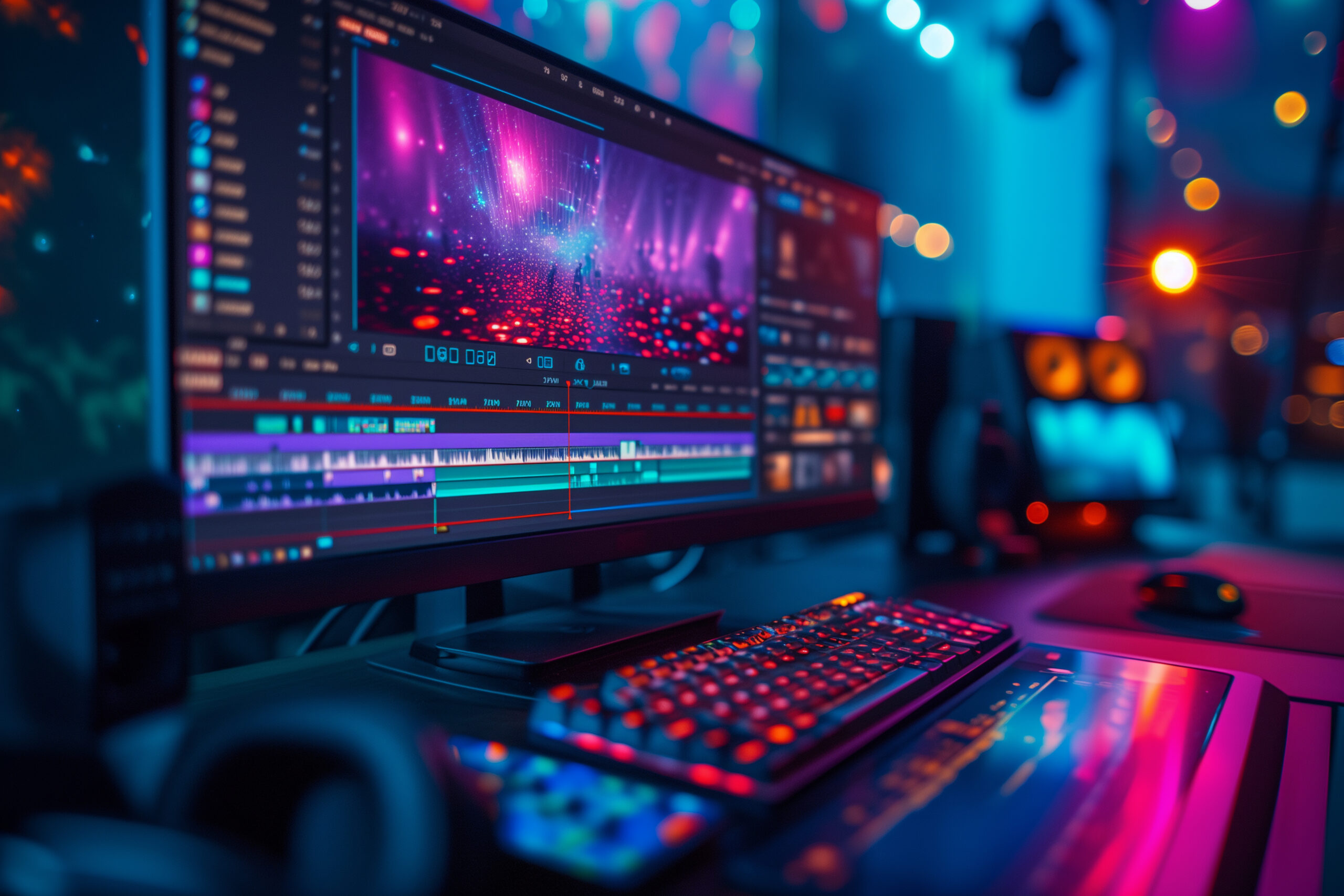
Tools and Software for Color Grading
To achieve the highest standards in color grading, our team utilizes state-of-the-art tools and software. Among these, DaVinci Resolve and Adobe Premiere Pro stand out for their robust color correction capabilities.
These platforms offer a wide range of features that help our colorists precisely adjust colors, balance exposure, and ensure that every frame aligns with the brand’s visual guidelines.
Additionally, specific plugins designed for these programs further enhance our ability to fine-tune colors and apply complex grading techniques efficiently (Using custom LUTs to force brand guidelines, for example).
Implementing Quality Assurance Processes
Our quality assurance processes are structured to catch and correct any deviations from the brand guidelines at multiple stages of video production.
We recommend everyone conducts regular QA checks using tools like scopes and waveform monitors, which provide objective measurements of color values, ensuring accuracy and consistency.
Our internal feedback loops are designed for quick resolution of issues, allowing colorists to communicate discrepancies to the project management team without delay.
Effective Communication Strategies
Communication is key in maintaining the integrity of a project. We ensure transparent communication with all stakeholders involved, providing clear, constructive feedback and making adjustments as necessary.
Our detailed change logs and before/after comparisons serve not only as a record of revisions but also as a tool to demonstrate to clients the adjustments made to align with brand guidelines.
For significant color corrections that entail additional work, we discuss these as separate items with our clients, ensuring they understand the necessity and scope of the work involved and more importantly ensuring any raw assets we correct for our productions are passed back to the source to ensure quality makes its way back into the holistic service line.
Training and Alignment
We invest in continuous training for our team to keep them updated on the latest techniques and tools in color grading and brand alignment.
Additionally, we conduct workshops for external contributors, including freelancers and partner agencies, to ensure that everyone involved in the production process understands and can execute the brand’s vision accurately.
If you ever interested in holding a workshop for your organization please get in touch. Our programs are built and tailored around your processes and technologies.
Case Study: Credit Card Brand Commercial Adaptation
In a recent project with the lead creative agency for a prominent credit card brand, we were tasked with resizing and adapting their TV commercial cuts for different stages of the customer funnel: awareness, consideration, and conversion.
The challenge was to ensure that each version not only met the technical requirements of various platforms but also aligned perfectly with the brand’s stringent color guidelines.
- Storyboarding and Animation: The project began with a detailed storyboard that adapted the TV commercial’s narrative for shorter formats typically used in digital advertising. Our animation team then created engaging visuals that maintained the brand’s aesthetic while highlighting key messages suitable for each funnel stage.
- Title Safe and Resizing: Each platform has its unique specifications for video content. We meticulously resized and adjusted the content to ensure it was ‘title safe’—meaning all critical information appeared within the viewable area across different devices and resolutions. This area can get quite intense and we have a whole article written on the topic – click here
- Color Grading: The cornerstone of this project was the color grading process. Using our predefined LUTs and referencing the provided brand color guidelines, we meticulously adjusted the hues, saturation, and brightness to ensure uniformity across all versions. Each piece was carefully reviewed against our reference materials to guarantee it met the exacting standards of the brand.
- Versioning for Funnel Stages: For the awareness stage, the focus was on broad appeal and brand recognition, utilizing vibrant colors and dynamic cuts. As we moved to the consideration stage, the visuals became more detailed, emphasizing reliability and trust with warmer tones. Finally, for the conversion stage, we used more direct calls-to-action with clear, contrasting colors to drive viewer action.
This project not only reinforced the brand’s visual identity across various platforms but also demonstrated our ability to adapt complex commercials to meet specific marketing objectives while maintaining the highest quality standards.
Conclusion
Through diligent application of the processes, tools, and techniques outlined, we ensure that every video project we undertake adheres strictly to brand guidelines. This commitment to quality not only enhances brand consistency but also builds trust with our clients, proving that their visual identity is in capable hands.
Are you looking to ensure your video content is not only creative but also consistent with your brand identity?